Design
Low-fidelity Wireframes
Created lo-fi wireframes with a clean layout, clear sections, and subpages to reduce clutter.
Click here to view the full lo-fi wireframes in Figma.
Usability Testing
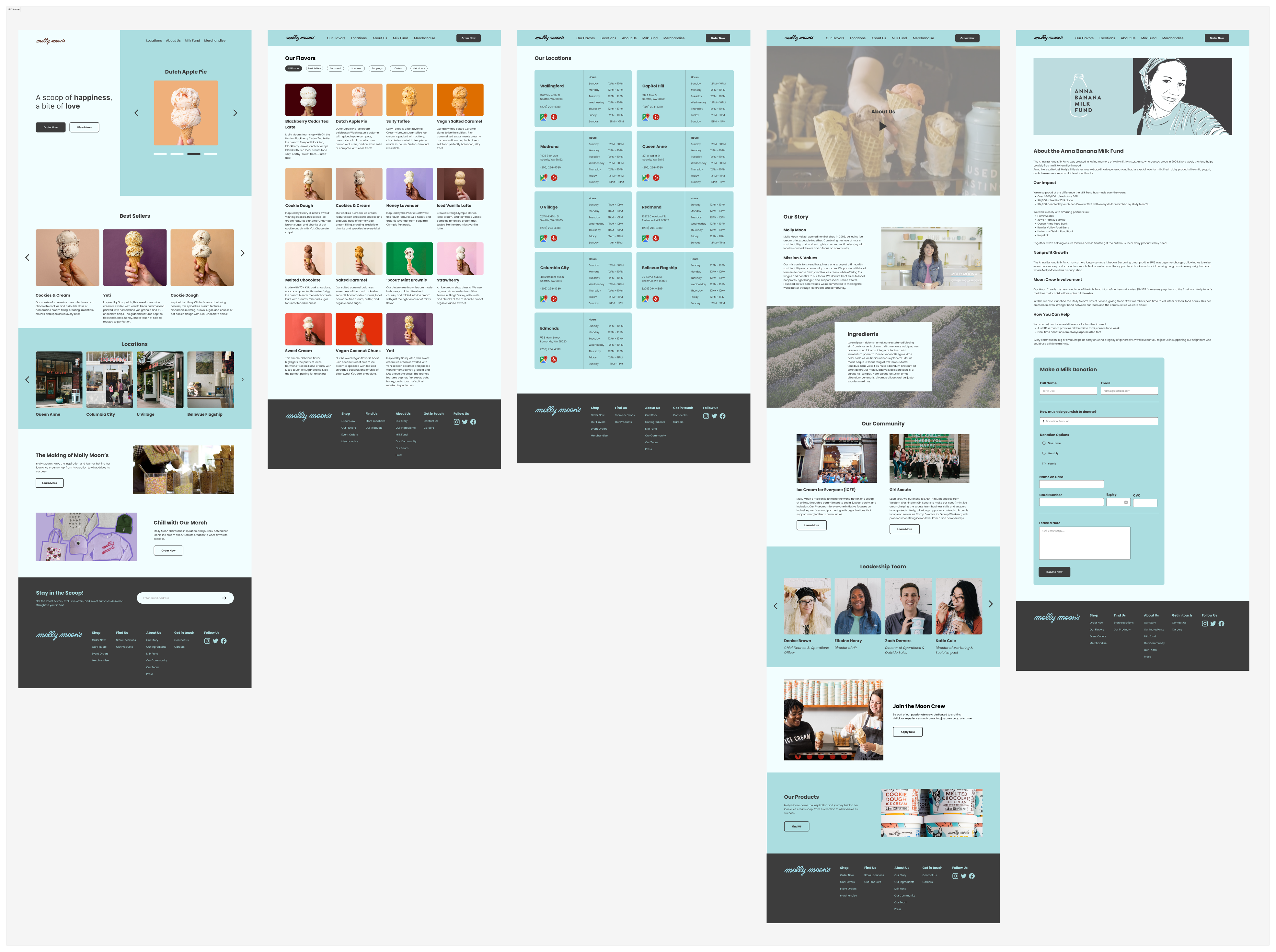
Participants felt the About page lacked impact, with key information like their Ice Cream for Everyone initiative, Girl Scout partnerships, and local product sourcing missing or hard to find.
Iterations
• Included the Milk Fund page in the navigation for better visibility.
• Created a dedicated section for community impact under "Our Community."
• Added a section for local products under "Our Products."
Before
Click here to view this lo-fi wireframe in Figma.
.png)
After
Click here to view this lo-fi wireframe in Figma.

High-fidelity Wireframes
Developed hi-fi wireframes with brand-aligned visuals, color, typography, and clear UI elements.
Click here to view the full hi-fi wireframes in Figma.


.png)


.png)

.png)


